For better experience 💚
Please rotate your device to landscape mode
Formula 1 Telemetry Analysis and Charts
FEEL FREE TO DOWNLOAD, EDIT, MODIFY AND SHARE THESE CHARTS. NO CREDITS NECESSARY💚
Frequently Asked Questions
Follow these steps to compare driver performance:
- Select a year from the dropdown (data available from 2018 onwards)
- Choose a specific Grand Prix event
- Select the session type (Practice, Qualifying, Sprint, Sprint Qualifying or Race)
- Choose multiple drivers to compare their performance
The interactive chart will display lap times for each selected driver, color-coded by team. Hover over data points to see detailed lap information.
Pro tip: Click on any lap point to view detailed telemetry data for that specific lap. Selected laps will appear in the dropdown below the chart for comparison.
Our F1 analytics dashboard includes comprehensive data from 2018 to the current season, covering:
- All Grand Prix events
- Qualifying sessions
- Practice sessions
- Sprint races (where applicable)
- Pre-season testing
The database is continuously updated with new races and sessions throughout each season.
Note: The 2020 season has fewer races due to the COVID-19 pandemic. Special events like sprint qualifying were introduced in 2021.
Data availability timeline:
- Practice sessions: Approximately 30 minutes after session completion
- Qualifying sessions: Approximately 30 minutes after session completion
- Sprint races: Approximately 30 minutes after race completion
- Grand Prix races: Approximately 30 minutes after race completion
All telemetry data is processed and made available as quickly as possible after each session concludes.
Tip: For race weekends, check back shortly after each session to access the latest data. Historical data from previous seasons is available immediately.
You can analyze comprehensive telemetry data including:
- Speed (km/h)
- Throttle input percentage
- Brake pressure application
- Gear selection
- DRS activation zones
- Lateral acceleration (G-forces)
- Longitudinal acceleration
- Track elevation changes
- Engine RPM
- Vertical acceleration
Pro tip: Double-click or use mouse wheel to zoom in on specific sections of the telemetry charts. Click and drag to pan across the data.
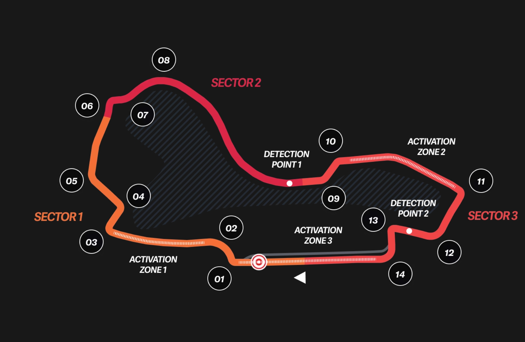
The Track Map is a visual representation of the Formula 1 circuit that shows you where each driver performs best. Here's what it displays:
- The actual shape of the track based on real telemetry data
- 25 equally divided mini-sectors, each colored according to which driver was fastest in that section
- Corner numbers in green circles showing the official track corners
How to read the Track Map:
- Colors: Each section of the track is colored based on the driver who was fastest through that part.
- Single driver: If you select only one driver, the entire track will be colored in that driver color.
- Multiple drivers: With multiple drivers selected, you'll see a color-coded performance comparison across the track.
Pro tip: Try selecting two drivers who are close in performance to see exactly where one gains time over the other around the circuit.
Fuel Correction is a feature that adjusts lap times to account for the changing weight of fuel in Formula 1 cars during a race. As cars burn fuel, they become progressively lighter, resulting in naturally faster lap times even without any improvement in driving or track conditions.
Why Fuel Correction matters:
- Weight impact: Each kilogram of fuel adds approximately 0.03 seconds per lap to a car's time
- Race strategy analysis: Helps distinguish between genuine pace improvements and those simply due to fuel load reduction
- Fair comparison: Enables meaningful comparison between laps from different stages of a race
- Performance evaluation: Provides a clearer picture of true car and driver performance throughout a race
How Fuel Correction is calculated:
Corrected Lap Time = Original Lap Time - (Fuel Weight Effect)
Where:
Fuel Weight Effect = Remaining Fuel (kg) × 0.03 seconds
Remaining Fuel = Initial Fuel × (1 - Current Lap / Total Race Laps)
The calculation uses these standard assumptions:
- Initial fuel load:
- Full Race: 100kg
- Sprint Race: 30kg
- Fuel consumption: Linear usage throughout the race (equal amount burned each lap)
- Performance impact: 0.03 seconds per kilogram of fuel per lap (industry standard approximation)
How to interpret Fuel-Corrected lap times:
- Early race laps: Will show faster corrected times than their actual times (compensating for heavy fuel load)
- Mid-race laps: Will show moderate correction
- Late race laps: Will show minimal correction (as cars are already light on fuel)
- Comparing drivers: Reveals true pace differences independent of fuel load advantages
- Stint analysis: Helps identify genuine tire degradation separate from the fuel weight effect
When to use Fuel Correction:
- Race pace analysis: When comparing laps from different stages of a race
- Strategy evaluation: When analyzing the effectiveness of different pit stop strategies
- Driver performance: When assessing a driver's consistency throughout a race
- Team comparisons: When comparing the race pace of different teams
Expert tip: Toggle the Fuel Correction checkbox on and off to see the difference between raw and corrected lap times. This is particularly revealing when analyzing the first stint of a race, where fuel weight has the most significant impact on performance.
Note: Fuel correction is an approximation based on standard assumptions. Actual fuel loads and consumption rates may vary between teams, cars, and race conditions. The correction provides a useful analytical tool but should be considered alongside other performance metrics.
The Elevation Chart is a critical tool for verifying data integrity and alignment between different drivers' telemetry. Since track elevation is a fixed geographical feature, all drivers should show nearly identical elevation profiles regardless of their performance.
Why the Elevation Chart matters for data integrity:
- Reference alignment: Track elevation is a constant physical property that all cars experience identically
- Data synchronization check: Misaligned elevation profiles immediately indicate synchronization issues
- Error detection: Helps identify corrupted or incorrectly processed telemetry data
- Baseline verification: Establishes confidence in the reliability of other telemetry channels
How to use the Elevation Chart for data validation:
- Visual inspection: Compare elevation profiles between multiple drivers - they should closely overlap
- Pattern matching: Look for consistent peaks and valleys across all selected drivers
- Offset detection: Check for horizontal shifts that indicate distance measurement errors
- Anomaly identification: Identify unusual spikes or drops that may indicate sensor errors
Common data integrity issues revealed by the Elevation Chart:
- Horizontal misalignment: Indicates distance measurement or synchronization errors
- Vertical scaling differences: May indicate drivers going over kerbs/bumps
- Missing segments: Reveals data gaps or transmission failures during recording
- Noise or jitter: Can indicate sensor interference or data processing problems
- Complete mismatch: Suggests incorrect lap selection or major data corruption
Pro tip: Always check the Elevation Chart first before analyzing other telemetry channels. If elevation profiles don't align properly, it's a strong indication that other telemetry comparisons (speed, throttle, braking) may be unreliable for that particular dataset.
Note: Minor variations in elevation data between drivers are normal due to sensor precision and sampling rates. However, significant differences that alter the overall profile shape indicate data integrity issues.